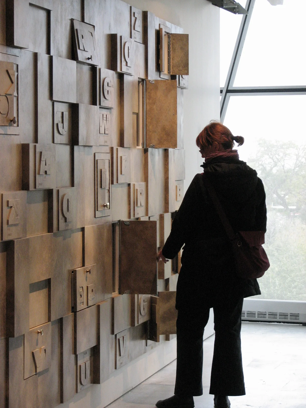
Spertus type
The Spertus Institute is a prominent center for Jewish learning and culture in Chicago. Working in collaboration with Redmoon Theater, I was commissioned to design a custom typeface for Spertus’ new interactive children’s center. The typeface design is a unique integration of forms inspired by the visual properties of the Latin and Hebrew alphabets. I worked with the interior architect to develop a wall relief that displays all the characters in a collage. Some of the panels open up to reveal dioramas.
The main challenge of this project was working with the fabricator on a tight budget to create something that could endure years of children interacting with it.


